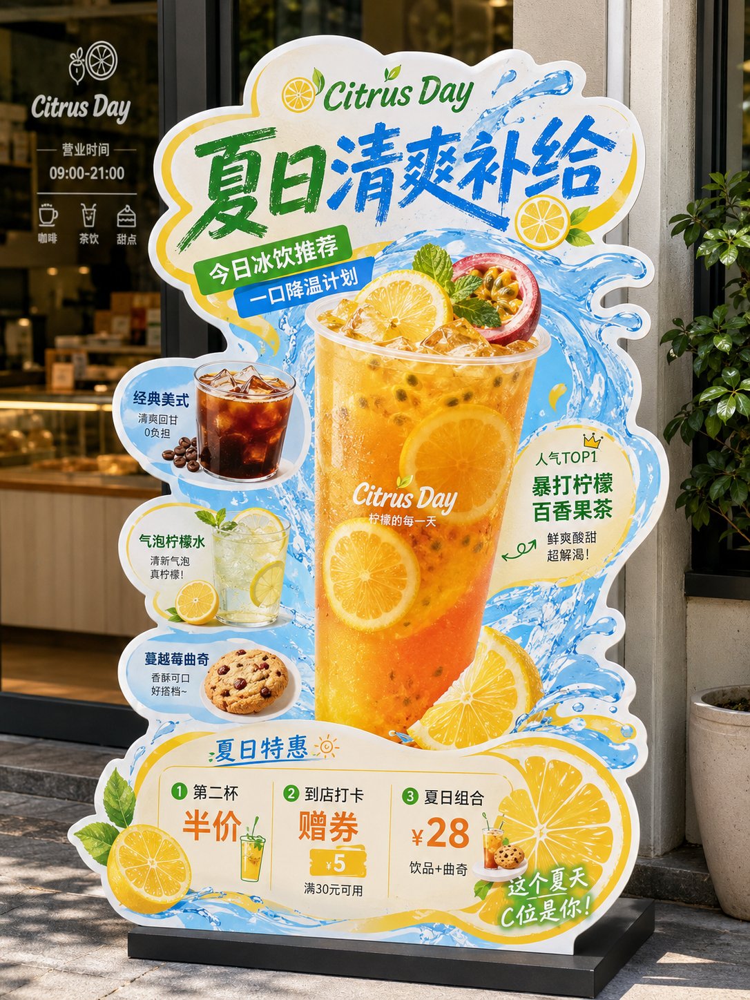
《餐饮异形展架/立牌物料》提示词: 请生成一张高完成度的「餐饮异形展架 / 立牌」设计图,用于展示餐饮门店的新品推荐、招牌产品、套餐促销或品牌活动信息。 【基础信息】 品牌名:【品牌名】 主标题:【主标题】 副标题:【副标题】 辅助短句:【短句1】|【短句2】|【短句3】 主题方向:【主题方向,例如:爆辣夜市风 / 金黄浓郁风 / 清新轻食风 / 山野自然风 / 甜品下午茶风 / 快餐促销风】 主色调:【主色调】 辅助色:【辅助色】 点缀色:【点缀色】 画幅比例:【建议 3:4 竖版】 【产品内容】 主推产品:【主推产品】 辅助产品1:【辅助产品1】 辅助产品2:【辅助产品2】 辅助产品3:【辅助产品3】 辅助产品4:【辅助产品4】 加料 / 配角产品:【加料或配角产品,例如:饮品 / 小食 / 配菜 / 酱料 / 甜品】 【卖点标签】 【卖点1】 【卖点2】 【卖点3】 【卖点4】 【卖点5】 【卖点6】 【促销信息】 【促销信息1】 【促销信息2】 【促销信息3】 【最重要要求】 避免生成门店场景效果图或墙上海报展示图。请直接生成“一张完整的异形立牌成品展示图”: - 背景必须为纯白色 - 画面中只保留一个完整的异形餐饮立牌主体 - 不要餐厅环境 - 不要商场背景 - 不要玻璃门、桌椅、墙面、人物、地面透视场景 - 不要任何真实空间背景 - 立牌主体必须完整显示 - 异形轮廓必须完整清晰 - 底座必须完整露出 - 整体像一张已经抠好的门店物料成品图 / 设计提案展示图 / 电商展示图 【画面形式】 这是一张“门店异形展架 / 立牌”的完整设计,避免普通矩形海报处理。 整体应采用明显的“不规则异形裁切轮廓”,有完整外边缘,边缘可带白色或浅色描边,具有真实门店物料感。 立牌应有明确底座,整体像可落地摆放的 KT 板 / 泡沫板 / 亚克力 / 写真喷绘展架成品。 【构图结构】 整体采用竖版、中心聚焦、信息分层清楚的结构: 1. 顶部区域: 放超大主标题,标题必须醒目、有冲击力、有餐饮 POP 招贴感。 字体可以厚重、手写感、招贴感、潮流感,但要清晰易读。 标题是整张图的第一视觉焦点。 2. 中部核心区域: 中间放最大主推产品,作为主视觉主体。 主菜必须最大、最饱满、最诱人,突出食欲感。 围绕主菜搭配 2~5 个辅助产品,形成丰富的产品组合,前后层次明确,主次分明。 3. 周边信息区域: 在主菜和辅助产品四周加入少量标签元素、推荐标、贴纸框、手写箭头、卖点说明、小标题、小气泡标签等,使其具有“餐饮门店促销物料”的视觉特征。 但要控制层级,做到“热闹但不乱”。 4. 底部促销区域: 底部放价格信息、套餐信息、活动信息或新品尝鲜信息。 价格数字要相对突出,易读清晰。 如果没有特别要求,默认不要二维码。 【视觉风格要求】 整体风格应属于“餐饮转化型视觉 + 门店 POP 异形立牌”: - 强调食欲感 - 强调信息可读性 - 强调商业落地感 - 强调门店物料感 - 强调异形轮廓感 避免极简杂志海报、电商详情页、纯平面插画海报方向。 【食物表现要求】 所有食物必须采用真实商业美食摄影质感: - 食物清晰真实 - 有食材颗粒感 - 有酱汁、汤汁、油光、热气、层次感 - 有丰富细节,如葱花、辣椒、芝士、香草、蔬菜、水果、虾仁、肉块等 - 主食要饱满,不能扁平 - 看起来必须“能激发食欲” 禁止过度插画化、卡通化、低质拼贴化。 【版式与信息层级】 整张立牌的阅读顺序应为: 主标题 → 主推产品 → 辅助产品 → 卖点标签 → 价格 / 活动信息 信息量可以较丰富,但必须有明确层级: - 主标题最大 - 主菜次大 - 辅助菜稍小 - 卖点标签较小 - 底部促销清晰醒目 【适配范围】 该模板需要适用于不同主题餐饮内容,例如: - 面 / 饭 / 粉 / 小吃 - 火锅 / 菌汤 / 地方菜 - 轻食 / 沙拉 / 咖啡简餐 - 早餐 / 套餐 / 快餐 - 茶饮 / 甜品 / 下午茶 - 节日促销 / 新品上市 / 爆品推荐 / 双人套餐 【输出要求】 请输出一张高清、清晰、商业完成度高的异形立牌设计图,满足以下条件: - 白色背景 - 完整异形轮廓 - 完整底座 - 只展示立牌本体 - 不带真实场景环境 - 不带人物 - 不带门店背景 - 默认不带二维码 - 适合用于系列案例展示、设计提案、社交媒体发布、模板复用
 查看原图
原始提示词
《餐饮异形展架/立牌物料》提示词: 请生成一张高完成度的「餐饮异形展架 / 立牌」设计图,用于展示餐饮门店的新品推荐、招牌产品、套餐促销或品牌活动信息。 【基础信息】 品牌名:【品牌名】 主标题:【主标题】 副标题:【副标题】 辅助短句:【短句1】|【短句2】|【短句3】 主题方向:【主题方向,例如:爆辣夜市风 / 金黄浓郁风 / 清新轻食风 / 山野自然风 / 甜品下午茶风 / 快餐促销风】 主色调:【主色调】 辅助色:【辅助色】 点缀色:【点缀色】 画幅比例:【建议 3:4 竖版】 【产品内容】 主推产品:【主推产品】 辅助产品1:【辅助产品1】 辅助产品2:【辅助产品2】 辅助产品3:【辅助产品3】 辅助产品4:【辅助产品4】 加料 / 配角产品:【加料或配角产品,例如:饮品 / 小食 / 配菜 / 酱料 / 甜品】 【卖点标签】 【卖点1】 【卖点2】 【卖点3】 【卖点4】 【卖点5】 【卖点6】 【促销信息】 【促销信息1】 【促销信息2】 【促销信息3】 【最重要要求】 避免生成门店场景效果图或墙上海报展示图。请直接生成“一张完整的异形立牌成品展示图”: - 背景必须为纯白色 - 画面中只保留一个完整的异形餐饮立牌主体 - 不要餐厅环境 - 不要商场背景 - 不要玻璃门、桌椅、墙面、人物、地面透视场景 - 不要任何真实空间背景 - 立牌主体必须完整显示 - 异形轮廓必须完整清晰 - 底座必须完整露出 - 整体像一张已经抠好的门店物料成品图 / 设计提案展示图 / 电商展示图 【画面形式】 这是一张“门店异形展架 / 立牌”的完整设计,避免普通矩形海报处理。 整体应采用明显的“不规则异形裁切轮廓”,有完整外边缘,边缘可带白色或浅色描边,具有真实门店物料感。 立牌应有明确底座,整体像可落地摆放的 KT 板 / 泡沫板 / 亚克力 / 写真喷绘展架成品。 【构图结构】 整体采用竖版、中心聚焦、信息分层清楚的结构: 1. 顶部区域: 放超大主标题,标题必须醒目、有冲击力、有餐饮 POP 招贴感。 字体可以厚重、手写感、招贴感、潮流感,但要清晰易读。 标题是整张图的第一视觉焦点。 2. 中部核心区域: 中间放最大主推产品,作为主视觉主体。 主菜必须最大、最饱满、最诱人,突出食欲感。 围绕主菜搭配 2~5 个辅助产品,形成丰富的产品组合,前后层次明确,主次分明。 3. 周边信息区域: 在主菜和辅助产品四周加入少量标签元素、推荐标、贴纸框、手写箭头、卖点说明、小标题、小气泡标签等,使其具有“餐饮门店促销物料”的视觉特征。 但要控制层级,做到“热闹但不乱”。 4. 底部促销区域: 底部放价格信息、套餐信息、活动信息或新品尝鲜信息。 价格数字要相对突出,易读清晰。 如果没有特别要求,默认不要二维码。 【视觉风格要求】 整体风格应属于“餐饮转化型视觉 + 门店 POP 异形立牌”: - 强调食欲感 - 强调信息可读性 - 强调商业落地感 - 强调门店物料感 - 强调异形轮廓感 避免极简杂志海报、电商详情页、纯平面插画海报方向。 【食物表现要求】 所有食物必须采用真实商业美食摄影质感: - 食物清晰真实 - 有食材颗粒感 - 有酱汁、汤汁、油光、热气、层次感 - 有丰富细节,如葱花、辣椒、芝士、香草、蔬菜、水果、虾仁、肉块等 - 主食要饱满,不能扁平 - 看起来必须“能激发食欲” 禁止过度插画化、卡通化、低质拼贴化。 【版式与信息层级】 整张立牌的阅读顺序应为: 主标题 → 主推产品 → 辅助产品 → 卖点标签 → 价格 / 活动信息 信息量可以较丰富,但必须有明确层级: - 主标题最大 - 主菜次大 - 辅助菜稍小 - 卖点标签较小 - 底部促销清晰醒目 【适配范围】 该模板需要适用于不同主题餐饮内容,例如: - 面 / 饭 / 粉 / 小吃 - 火锅 / 菌汤 / 地方菜 - 轻食 / 沙拉 / 咖啡简餐 - 早餐 / 套餐 / 快餐 - 茶饮 / 甜品 / 下午茶 - 节日促销 / 新品上市 / 爆品推荐 / 双人套餐 【输出要求】 请输出一张高清、清晰、商业完成度高的异形立牌设计图,满足以下条件: - 白色背景 - 完整异形轮廓 - 完整底座 - 只展示立牌本体 - 不带真实场景环境 - 不带人物 - 不带门店背景 - 默认不带二维码 - 适合用于系列案例展示、设计提案、社交媒体发布、模板复用
以上为来源页所载提示词,可选中文本复制。本站译文与解读在下方单独列出。
中英对照
本条译文由自动翻译生成,可与原文对照使用。
Prompt word for "Catering Special-shaped Display Rack/Sign Up Material": Please generate a highly complete 「餐饮异形展架 / 立牌」 design drawing to display new product recommendations, signature products, package promotions or brand activity information for catering stores. 【基础信息】 Brand name: 【品牌名】 Main title: 【主标题】 Subtitle: 【副标题】 Auxiliary phrases: 【短句1】 | 【短句2】 | 【短句3】 Theme direction: 【主题方向,例如:爆辣夜市风 / 金黄浓郁风 / 清新轻食风 / 山野自然风 / 甜品下午茶风 / 快餐促销风】 Main color: 【主色调】 Auxiliary color: 【辅助色】 Embellishment color: 【点缀色】 Aspect ratio: 【建议 3:4 竖版】 【产品内容】 Main products: 【主推产品】 Auxiliary products 1: 【辅助产品1】 Auxiliary products 2: 【辅助产品2】 Auxiliary products 3: 【辅助产品3】 Auxiliary products 4: 【辅助产品4】 Additional materials/supporting products: 【加料或配角产品,例如:饮品 / 小食 / 配菜 / 酱料 / 甜品】 【卖点标签】 【卖点1】 【卖点2】 【卖点3】 【卖点4】 【卖点5】 【卖点6】 【促销信息】 【促销信息1】 【促销信息2】 【促销信息3】 【最重要要求】 Avoid generating store scene renderings or wall poster display images. Please generate “一张完整的异形立牌成品展示图” directly: - The background must be pure white -Only one complete main body of the special-shaped catering stand remains in the picture. - No restaurant environment required - No shopping mall background - Do not use glass doors, tables, chairs, walls, people, or floor perspective scenes - No real space background required - The main body of the stand must be fully displayed - The contour of the special shape must be complete and clear - The base must be completely exposed - The whole thing looks like a finished store material picture/design proposal display picture/e-commerce display picture 【画面形式】 This is a complete design of “门店异形展架 / 立牌” that avoids the usual rectangular poster treatment. The overall design should be clearly “不规则异形裁切轮廓”, with a complete outer edge, and the edge can have a white or light-colored stroke, giving it a real store material feel. The standing sign should have a clear base, and the overall image should be a finished KT board/foam board/acrylic/photo inkjet display stand that can be placed on the floor. 【构图结构】 The overall structure adopts vertical layout, central focus, and clear information layering: 1 . Top area: Put an oversized main title. The title must be eye-catching, impactful, and have the feel of a catering POP poster. The font can be thick, handwriting-like, poster-like, or trendy, but it should be clear and easy to read. The title is the first visual focus of the entire image. 2. Central core area: The most popular product is placed in the middle as the main visual subject. The main course must be the largest, most filling, and most tempting, highlighting the appetite. Pair 2 ~ 5 auxiliary products around the main course to form a rich product portfolio with clear front and back levels and clear priorities. 3 . Surrounding information area: Add a small number of label elements, recommendation labels, sticker boxes, handwritten arrows, selling point descriptions, subtitles, small bubble labels, etc. around the main dishes and auxiliary products to give them the visual characteristics of “餐饮门店促销物料”. But control the level to achieve “热闹但不乱”. 4 . Bottom promotion area: Put price information, package information, event information or fresh food information at the bottom. The price figures should be relatively prominent and easy to read. If there are no special requirements, no QR code is required by default. 【视觉风格要求】 The overall style should belong to “餐饮转化型视觉 + 门店 POP 异形立牌”: - Emphasis on appetite - Emphasize information readability - Emphasize the sense of commercial landing - Emphasis on the material feel of the store - Emphasis on the sense of special-shaped contours Avoid minimalist magazine posters, e-commerce detail pages, and pure flat illustration posters. 【食物表现要求】 All food must use real commercial food photography textures: - Food is clear and authentic - Food grainy texture - There are sauces, soups, oily, hot, and layered textures - There are rich details, such as green onions, peppers, cheese, herbs, vegetables, fruits, shrimps, meat cubes, etc. - Staple food should be plump and not flat - Looks like it must be “能激发食欲” Excessive illustrations, cartoons, and low-quality collages are prohibited. 【版式与信息层级】 The reading order of the entire standing card should be: Main title → Main product → Auxiliary product → Selling point label → Price/activity information The amount of information can be rich, but it must have a clear hierarchy: - Main title max - The second largest main course - The auxiliary dishes are slightly smaller - Selling point label is smaller - The bottom promotion is clear and eye-catching 【适配范围】 The template needs to be suitable for different themed catering content, for example: - Noodles/rice/noodles/snacks - Hot pot/Mushroom soup/Local cuisine - Light snacks/salads/coffee snacks - Breakfast/Set Meal/Fast Food - Tea / Dessert / Afternoon Tea - Holiday promotions / new product launches / hot product recommendations / set meal for two persons 【输出要求】 Please output a high-definition, clear, and highly commercially complete special-shaped stand design drawing that meets the following conditions: - White background - Complete profile - Complete base - Only the standing sign body is displayed - Without real scene environment - Without character - Without store background - No QR code by default - Suitable for series case presentations, design proposals, social media releases, and template reuse