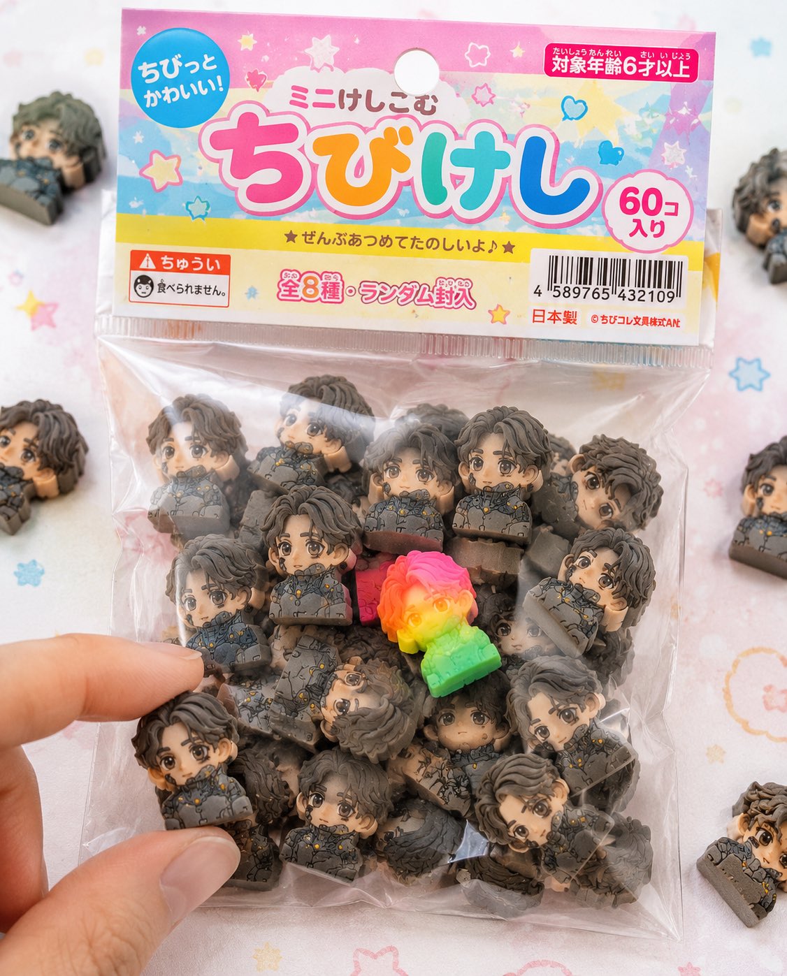
请将所附角色设定图作为必须严格遵循的设计参考。绝对不要改变角色的脸、发型、眼睛形状和身体比例。 ■目的:将角色完整地开发成日本的“迷你角色橡皮商品”,制作真实的带包装商品照片,使其看起来像实际在文具卖场或扭蛋机中销售的商品。 ■概念:“在100日元店或文具店出售的袋装迷你橡皮商品”。 ■橡皮本体:(※完全保持与上次相同的规格)- 高度夸张的Q版角色造型 - 厚实的块状形态 - 完全哑光的橡胶材质 - 带有细微颗粒、粉末、削痕和磨损 - 带有印刷错位和颜色偏差 - 随机组合50个以上。 ■包装(非常重要):- 小型透明塑料袋(OPP袋)- 顶部带纸质封头卡(有悬挂孔)- 封头卡的印刷略显廉价(轻微错位、油墨不均)- 塑料袋有褶皱、略显浑浊,并因静电贴附在内容物上 - 部分位置因进入空气而鼓起 - 封口处略有皱折。 ■平面设计:- 日本儿童文具风格的设计 - 活泼、多彩(以粉色、黄色、浅蓝色为主)- 手写风字体或圆润字体 - 商品名称标志(可以原创)- 印有「ミニけし」「ちびけし」等字样 - 星星、爱心和闪亮装饰。 ■信息元素(增强真实感):- JAN码(条形码)- 「対象年齢6才以上」- 「食べられません」警示文字 - 「全◯種」或「ランダム封入」- 小号公司名称(虚构)- MADE IN JAPAN or CHINA字样。 ■构图:- 包装作为主体位于画面中央 - 周围散落少量橡皮 - 有1〜2个放在袋外 - 营造指尖正要捏起其中1个的动作 - 部分物体伸出画面边缘,以增加自然感。 ■稀有款元素:- 混入1个采用荧光色或渐变色的特殊款 - 放置在醒目位置,引导视线。 ■光线:- 明亮的自然光(略偏高调)- 柔和阴影 - 如商品摄影般干净清爽。 ■相机:- 偏微距拍摄 - 浅景深 - 中央清晰锐利。 ■背景:- 白色至粉彩色调的桌面 - 带有淡淡的圆点或活泼图案 - 简单、干净。 ■禁止:- 塑料质感 - 亮面光泽表现 - 过于高档的质感(应当呈现廉价感)- 过于完美的印刷。 ■输出:- 真实到只能被看作实物商品的程度 - 具有仿佛能在便利店或100日元店找到的真实感 - 完成度足以让人在社交媒体上看到后产生“我想要这个”的想法。
 查看原图
原始提示词
添付されたキャラクターシートをSTRICTなデザインリファレンスとして使用すること。 キャラクターの顔、髪型、目の形、プロポーションは絶対に変更しない。 ■目的: キャラクターを日本の「ちび消しゴム商品」として完全に商品化し、 実際に文房具売り場やガチャで販売されているようなリアルなパッケージ商品写真を作成する。 ■コンセプト: 「100円ショップや文房具店で売られている袋入りちび消しゴム商品」 ■消しゴム本体: (※前回と同じ仕様を完全維持) - 強いデフォルメちびキャラ - 厚みのあるブロック形状 - 完全マットなラバー素材 - 微細な粒子・粉・削れ・摩耗あり - 印刷ズレ・色ブレあり - 50個以上のランダム構成 ■パッケージ(超重要): - 小さな透明ビニール袋(OPP袋) - 上部に紙ヘッダー(吊り下げ用の穴あり) - ヘッダーはややチープな印刷(軽いズレ・インクのムラ) - ビニールはシワあり、やや曇り、静電気で中身に張り付く - 一部空気が入ってふくらみあり - シール部分に軽いヨレ ■グラフィックデザイン: - 日本の子供向け文房具風デザイン - ポップでカラフル(ピンク・黄色・水色ベース) - 手書き風フォントや丸文字 - 商品名ロゴ(オリジナルでOK) - 「ミニけし」「ちびけし」などの表記 - 星・ハート・キラキラ装飾 ■情報要素(リアル感強化): - JANコード(バーコード) - 「対象年齢6才以上」 - 「食べられません」注意書き - 「全◯種」や「ランダム封入」 - 小さな会社名(架空) - MADE IN JAPAN or CHINA表記 ■構図: - パッケージがメインで画面中央 - 周囲に少しだけこぼれた消しゴム - 1〜2個は袋から出ている - 指先が1つをつまもうとしている演出 - 一部フレームアウトで自然さ ■レア要素: - 蛍光カラーやグラデーションの特別個体を1つ混ぜる - 視線誘導として目立つ位置に配置 ■ライティング: - 明るい自然光(ややハイキー) - 柔らかい影 - 商品写真のような清潔感 ■カメラ: - マクロ寄り - 浅い被写界深度 - 中央シャープ ■背景: - 白〜パステルのテーブル - ほんのりドットやポップ柄 - シンプルで清潔 ■禁止: - プラスチック感 - glossy表現 - 高級すぎる質感(安っぽさが正解) - 完璧すぎる印刷 ■出力: - 実在する商品にしか見えないレベル - コンビニや100均にありそうなリアリティ - SNSで「これ欲しい」と思わせる完成度
以上为来源页所载提示词,可选中文本复制。本站译文与解读在下方单独列出。
中英对照
Use the attached character sheet as a STRICT design reference. Never change the character's face, hairstyle, eye shape, or proportions. ■ Purpose: Fully turn the character into a Japanese miniature character eraser product, and create a realistic photograph of the packaged product that looks as if it is actually sold in a stationery department or a capsule-toy vending machine. ■ Concept: "A bagged miniature eraser product sold at a 100-yen shop or a stationery store." ■ Erasers: (※ Fully maintain the same specifications as last time.) - Highly exaggerated chibi character designs - Thick, block-like shapes - Completely matte rubber material - Fine particles, powder, nicks, and wear - Printing misregistration and color variation - A random assortment of 50 or more pieces. ■ Packaging (extremely important): - A small transparent plastic bag (OPP bag) - A paper header at the top (with a hole for hanging) - Slightly cheap-looking printing on the header (minor misregistration and uneven ink) - The plastic is wrinkled, slightly cloudy, and clings to the contents through static electricity - Some areas puff out with trapped air - Slight creasing at the sealed edge. ■ Graphic design: - A design reminiscent of Japanese children's stationery - Playful and colorful (primarily pink, yellow, and light blue) - Handwritten-style or rounded lettering - A product-name logo (an original one is fine) - Labels such as 「ミニけし」 and 「ちびけし」 - Stars, hearts, and sparkling decorations. ■ Information elements (to reinforce realism): - A JAN code (barcode) - 「対象年齢6才以上」 - The warning 「食べられません」 - 「全◯種」 or 「ランダム封入」 - A small company name (fictional) - The wording MADE IN JAPAN or CHINA. ■ Composition: - The package is the main subject, centered in the frame - A few erasers are scattered around it - 1〜2 pieces are outside the bag - Show fingertips about to pick up 1 piece - Let some objects extend outside the frame for a natural feel. ■ Rare variant: - Mix in 1 special piece with fluorescent colors or a gradient - Place it in a conspicuous position to guide the viewer's eye. ■ Lighting: - Bright natural light (slightly high-key) - Soft shadows - The clean look of product photography. ■ Camera: - Close to macro photography - Shallow depth of field - A sharp center. ■ Background: - A white to pastel-colored tabletop - Subtle dots or playful patterns - Simple and clean. ■ Prohibited: - A plastic look - Glossy rendering - An overly premium texture (a cheap look is the correct choice) - Overly perfect printing. ■ Output: - A result that can only be perceived as a real physical product - Realism suggesting something found in a convenience store or a 100-yen shop - A level of finish that makes people on social media think, "I want this."