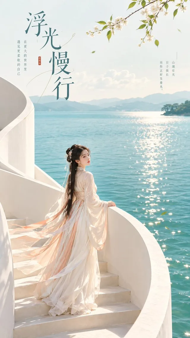
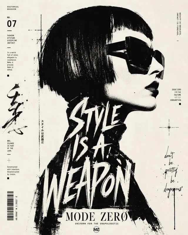
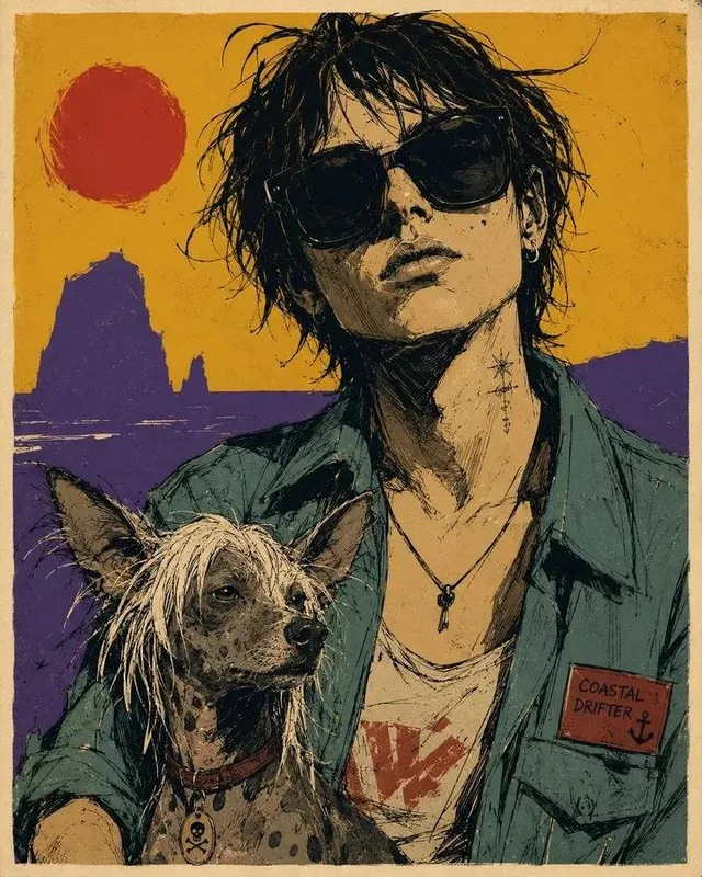
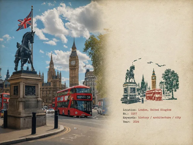
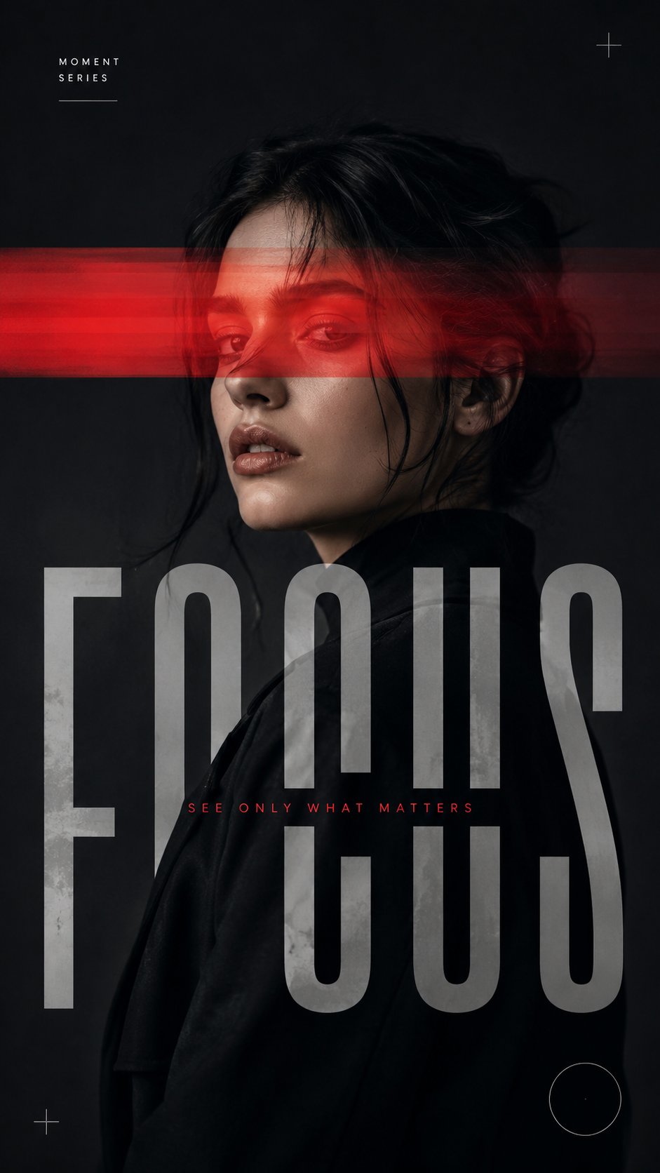
使用以下可自定义输入创建中型 9:16 实验性编辑肖像海报: 主题:[Adult Male or Female Portrait] 干扰:[Color Split / Narrow Light Beam / Horizontal Cut / Motion Veil] 标题: [Title] 调色板:[Main Neutral Tones + One Accent Color] 心情: [Sharp / Cinematic / Restrained / Experimental] 创建引人注目的特写或腰部肖像,让拍摄对象占据画面的大部分。保留真实的面部特征、自然的皮肤纹理、真实的头发、真实的比例、清晰的情感和强烈的轮廓。在应用图形干预之前,肖像必须在视觉上像时尚照片一样。 仅使用一种主要干扰方法: Color Split:不均匀的半透明带选择性地移动、显示、分离或扭曲肖像的部分。 Narrow Light Beam:单个受控光束穿过面部或身体,并自然地延伸到周围空间。 Horizontal Cut:粗体水平带中断了肖像的选定区域,并与超大字体相互作用。 Motion Veil:保持主肖像清晰,同时选定区域创建微妙的水平摄影运动轨迹。 使版式成为构图的一个组成部分。使用一个占主导地位的标题,允许字母裁剪到框架之外、与主题重叠、消失在正文后面或与干扰相互作用。 保持最少的支持文本:一个小型系列标签和一个简短短语。 主要使用黑色、白色、灰色、木炭色或深中性色 色调,加上一种强调色。保持肤色自然,避免过度温暖或黄色分级。 必要时仅添加一些微妙的图形细节,例如细线、圆圈或开放角标记。 最终的作品应该感觉像是一篇优质的时尚社论、当代摄影海报或实验性艺术指导作品——干净、有意、精致且视觉平衡。 避免多重竞争效果、密集文本、UI 元素、严重故障、随机拼贴、过度装饰、编号、“Vol.” 或 “Issue” 标签、闪光符号、徽标、水印、扭曲的解剖结构、塑料皮肤、过饱和度和通用模板美观。 保持整体处理媒介的规模、精致、适应性和普遍适用于不同的人、标题、主题、调色板和编辑概念。
 查看原图
原始提示词
Create a medium-sized 9:16 experimental editorial portrait poster using the following customizable inputs: Subject: [Adult Male or Female Portrait] Interference: [Color Split / Narrow Light Beam / Horizontal Cut / Motion Veil] Title: [Title] Palette: [Main Neutral Tones + One Accent Color] Mood: [Sharp / Cinematic / Restrained / Experimental] Create a striking close-up or waist-up portrait with the subject occupying a strong portion of the frame. Preserve realistic facial features, natural skin texture, authentic hair, realistic proportions, clear emotion, and a strong silhouette. The portrait must work visually as a fashion photograph before the graphic intervention is applied. Use only one primary interference method: Color Split: Uneven translucent bands selectively shift, reveal, separate, or distort portions of the portrait. Narrow Light Beam: A single controlled beam cuts across the face or body and continues naturally into the surrounding space. Horizontal Cut: Bold horizontal bands interrupt selected areas of the portrait and interact with oversized typography. Motion Veil: Keep the main portrait sharp while selected areas create subtle horizontal photographic motion trails. Make typography an integral part of the composition. Use one dominant headline, allowing letters to crop beyond the frame, overlap the subject, disappear behind the body, or interact with the interference. Keep supporting text minimal: one small series label and one short phrase. Use mostly black, white, grey, charcoal, or deep neutral tones, plus one accent color. Keep skin tones natural and avoid excessive warmth or yellow grading. Add only a few subtle graphic details such as fine lines, circles, or open corner marks when necessary. The final composition should feel like a premium fashion editorial, contemporary photography poster, or experimental art-direction piece—clean, intentional, sophisticated, and visually balanced. Avoid multiple competing effects, dense text, UI elements, heavy glitches, random collage, excessive decoration, numbering, “Vol.” or “Issue” labels, sparkle symbols, logos, watermarks, distorted anatomy, plastic skin, oversaturation, and generic template aesthetics. Keep the overall treatment medium in scale, refined, adaptable, and universally applicable to different people, titles, themes, palettes, and editorial concepts.
以上为来源页所载提示词,可选中文本复制。本站译文与解读在下方单独列出。
中英对照
本条译文由自动翻译生成,可与原文对照使用。
Create a medium-sized 9:16 experimental editorial portrait poster using the following customizable inputs: Subject: [Adult Male or Female Portrait] Interference: [Color Split / Narrow Light Beam / Horizontal Cut / Motion Veil] Title: [Title] Palette: [Main Neutral Tones + One Accent Color] Mood: [Sharp / Cinematic / Restrained / Experimental] Create a striking close-up or waist-up portrait with the subject occupying a strong portion of the frame. Preserve realistic facial features, natural skin texture, authentic hair, realistic proportions, clear emotion, and a strong silhouette. The portrait must work visually as a fashion photograph before the graphic intervention is applied. Use only one primary interference method: Color Split: Uneven translucent bands selectively shift, reveal, separate, or distort portions of the portrait. Narrow Light Beam: A single controlled beam cuts across the face or body and continues naturally into the surrounding space. Horizontal Cut: Bold horizontal bands interrupt selected areas of the portrait and interact with oversized typography. Motion Veil: Keep the main portrait sharp while selected areas create subtle horizontal photographic motion trails. Make typography an integral part of the composition. Use one dominant headline, allowing letters to crop beyond the frame, overlap the subject, disappear behind the body, or interact with the interference. Keep supporting text minimal: one small series label and one short phrase. Use mostly black, white, grey, charcoal, or deep neutral tones, plus one accent color. Keep skin tones natural and avoid excessive warmth or yellow grading. Add only a few subtle graphic details such as fine lines, circles, or open corner marks when necessary. The final composition should feel like a premium fashion editorial, contemporary photography poster, or experimental art-direction piece—clean, intentional, sophisticated, and visually balanced. Avoid multiple competing effects, dense text, UI elements, heavy glitches, random collage, excessive decoration, numbering, “Vol.” or “Issue” labels, sparkle symbols, logos, watermarks, distorted anatomy, plastic skin, oversaturation, and generic template aesthetics. Keep the overall treatment medium in scale, refined, adaptable, and universally applicable to different people, titles, themes, palettes, and editorial concepts.