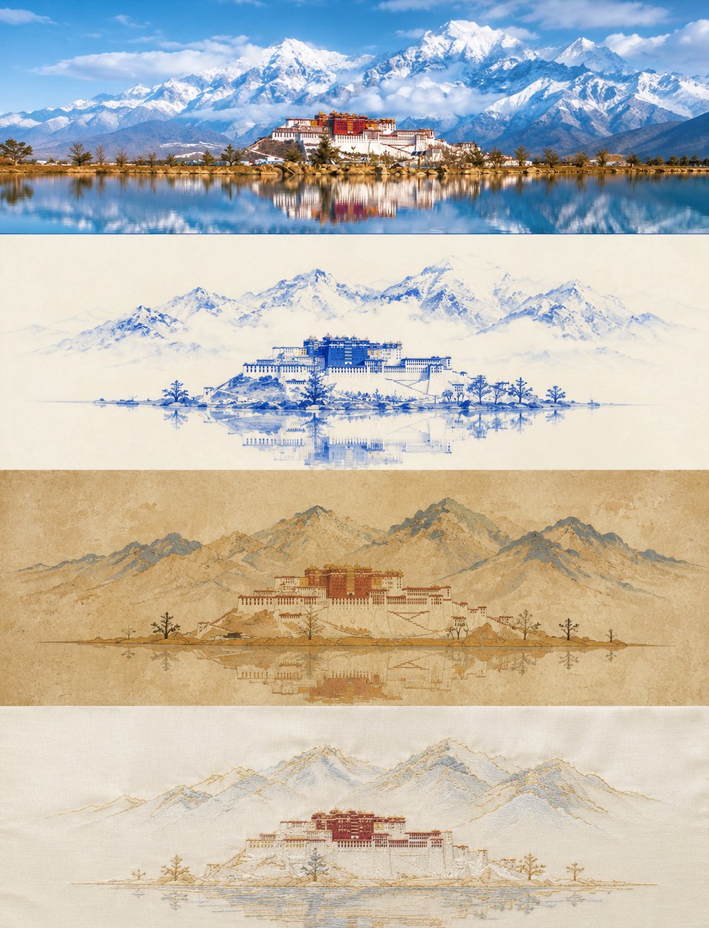
请将我上传的照片制作成一张竖版拼图海报,整体采用 3:4 竖版构图。画面从上到下严格四等分为四个横向区域,每个区域的高度必须精确控制为整体画面高度的25%(四层比例严格为1:1:1:1,不允许出现比例偏差),区域之间无缝衔接,不设分隔线、不留间隙,顺序为:原图→风格1→风格2→风格3。由于每层为约3:1的极扁宽幅比例,各层主体建议横向居中排布,强调左右开阔留白与呼吸感,避免元素纵向拉伸变形或贴边拥挤。四层在人物站位、场景结构、视线方向上保持连贯呼应,呈现同一画面、四种转译的整体感。风格层(第二至四层)须遵循极简原则:每层视觉元素数量压缩至最低限度,只保留1个最核心的主体符号,其余次要装饰、背景细节与陪衬元素一律省略,画面留白占比不低于60%。 第一层保留原始照片的主体结构、人物真实互动关系与姿态、真实质感、自然光影与原有色彩氛围,仅进行轻微高级摄影调色,呈现杂志摄影质感,不改变人物关系与构图逻辑,并可在不改变人物关系与构图逻辑的前提下自然扩展天空、地面或环境背景,使整体更具空间感与叙事感。 第二层为青花瓷绘风格:借鉴青花瓷绘画技法,以钴蓝色线条与晕染在米白底上表现人物与场景,呈现瓷器纹样的疏朗雅致感。色彩以钴蓝与米白为主的单色系。避免蓝色浓淡层次过多显杂,避免图案化装饰堆砌。 第三层为敦煌壁画风格:借鉴敦煌壁画矿物重彩质感,表现古朴斑驳的美感,需简化线条与色块。背景为土黄或赭石底色,带斑驳壁画肌理感。色彩以赭石、石青、朱砂、土黄为主。避免裂纹肌理过多堆砌,避免复杂纹样装饰。 第四层为刺绣锦缎风格:以刺绣针脚肌理表现人物与场景轮廓,呈现丝缎光泽与针线纹理感,图案需极简概括。背景为米白或浅灰缎面底色。色彩以2至3种柔和色搭配金线点缀。避免针脚过密显繁琐,避免金线过多显浮夸。 每一层需将主体与场景统一转换为对应风格,整体表达极度克制与简化,只保留最核心的一个主体符号及其基本轮廓关系,删除一切非必要的背景元素、装饰细节与陪衬物;人物之间的关键位置关系、互动方向与姿态特征需保留,但应抽象为可识别的轮廓关系,做到“元素越少、关系越清晰”。色彩均从原图中提取归纳,每层严格控制在2-4种主色以内。四个区域的高度比例须严格保持1:1:1:1(各占25%),不可出现拼接错位或比例偏差。整体避免朋克/赛博朋克风格、写实照片质感强行叠加、卡通风格、3D渲染感、商业海报感、复杂背景堆砌、元素过多或画面拥挤、相邻两层风格雷同,以及任何文字、Logo、水印或标题。
 查看原图
原始提示词
请将我上传的照片制作成一张竖版拼图海报,整体采用 3:4 竖版构图。画面从上到下严格四等分为四个横向区域,每个区域的高度必须精确控制为整体画面高度的25%(四层比例严格为1:1:1:1,不允许出现比例偏差),区域之间无缝衔接,不设分隔线、不留间隙,顺序为:原图→风格1→风格2→风格3。由于每层为约3:1的极扁宽幅比例,各层主体建议横向居中排布,强调左右开阔留白与呼吸感,避免元素纵向拉伸变形或贴边拥挤。四层在人物站位、场景结构、视线方向上保持连贯呼应,呈现同一画面、四种转译的整体感。风格层(第二至四层)须遵循极简原则:每层视觉元素数量压缩至最低限度,只保留1个最核心的主体符号,其余次要装饰、背景细节与陪衬元素一律省略,画面留白占比不低于60%。 第一层保留原始照片的主体结构、人物真实互动关系与姿态、真实质感、自然光影与原有色彩氛围,仅进行轻微高级摄影调色,呈现杂志摄影质感,不改变人物关系与构图逻辑,并可在不改变人物关系与构图逻辑的前提下自然扩展天空、地面或环境背景,使整体更具空间感与叙事感。 第二层为青花瓷绘风格:借鉴青花瓷绘画技法,以钴蓝色线条与晕染在米白底上表现人物与场景,呈现瓷器纹样的疏朗雅致感。色彩以钴蓝与米白为主的单色系。避免蓝色浓淡层次过多显杂,避免图案化装饰堆砌。 第三层为敦煌壁画风格:借鉴敦煌壁画矿物重彩质感,表现古朴斑驳的美感,需简化线条与色块。背景为土黄或赭石底色,带斑驳壁画肌理感。色彩以赭石、石青、朱砂、土黄为主。避免裂纹肌理过多堆砌,避免复杂纹样装饰。 第四层为刺绣锦缎风格:以刺绣针脚肌理表现人物与场景轮廓,呈现丝缎光泽与针线纹理感,图案需极简概括。背景为米白或浅灰缎面底色。色彩以2至3种柔和色搭配金线点缀。避免针脚过密显繁琐,避免金线过多显浮夸。 每一层需将主体与场景统一转换为对应风格,整体表达极度克制与简化,只保留最核心的一个主体符号及其基本轮廓关系,删除一切非必要的背景元素、装饰细节与陪衬物;人物之间的关键位置关系、互动方向与姿态特征需保留,但应抽象为可识别的轮廓关系,做到“元素越少、关系越清晰”。色彩均从原图中提取归纳,每层严格控制在2-4种主色以内。四个区域的高度比例须严格保持1:1:1:1(各占25%),不可出现拼接错位或比例偏差。整体避免朋克/赛博朋克风格、写实照片质感强行叠加、卡通风格、3D渲染感、商业海报感、复杂背景堆砌、元素过多或画面拥挤、相邻两层风格雷同,以及任何文字、Logo、水印或标题。
以上为来源页所载提示词,可选中文本复制。本站译文与解读在下方单独列出。
中英对照
本条译文由自动翻译生成,可与原文对照使用。
Please make the photo I uploaded into a vertical puzzle poster, using the overall vertical composition of 3:4. The picture is strictly divided into four horizontal areas from top to bottom. The height of each area must be accurately controlled to 25% of the overall picture height (the ratio of the four layers is strictly 1:1:1 : 1, no proportional deviation is allowed). The areas are seamlessly connected without dividing lines or gaps. The order is: original image → style 1 → style 2 → style 3. Since each layer has an extremely flat width ratio of about 3:1, it is recommended that the main bodies of each layer be arranged horizontally and centrally, emphasizing the open space on the left and right and the sense of breathing, and avoiding longitudinal stretching and deformation of elements or crowding of edges. The four floors maintain a coherent response in terms of character positions, scene structure, and line of sight directions, presenting an overall sense of the same picture and four translations. The style layer (second to fourth layers) must follow the principle of minimalism: the number of visual elements in each layer is compressed to the minimum, and only the core main symbols of 1 are retained. All other secondary decorations, background details and foil elements are omitted, and the proportion of blank space on the screen is no less than 60%. The first layer retains the main structure of the original photo, the real interaction and posture of the characters, the real texture, natural light and shadow, and the original color atmosphere. It only performs a slight advanced photography color correction to present the texture of magazine photography without changing the relationship between the characters and the logic of the composition. It can also naturally expand the sky, ground, or environmental background without changing the relationship between the characters and the logic of the composition, making the whole more spatial and narrative. The second layer is a blue and white porcelain painting style: drawing on blue and white porcelain painting techniques, cobalt blue lines and smudges are used to express characters and scenes on an off-white background, presenting the sparse and elegant feel of porcelain patterns. The colors are mainly monochromatic, cobalt blue and off-white. Avoid too many blue shades and layers, and avoid stacking of patterned decorations. The third layer is the Dunhuang mural style: drawing on the mineral and heavy color texture of Dunhuang murals to express the simple and mottled beauty, it is necessary to simplify the lines and color blocks. The background is earthy yellow or ocher, with a mottled mural texture. The colors are mainly ocher, azurite, cinnabar, and earthy yellow. Avoid excessive accumulation of crack texture and avoid complex pattern decoration. The fourth layer is embroidered brocade style: the texture of embroidery stitches is used to express the outline of characters and scenes, showing the luster of silk satin and the texture of needlework. The pattern needs to be minimalist and summarized. The background is off-white or light gray satin. The color is composed of soft colors from 2 to 3 with gold accents. Avoid too dense stitches to look cumbersome, and avoid too many gold threads to look exaggerated. Each layer needs to uniformly transform the subject and scene into the corresponding style. The overall expression is extremely restrained and simplified. Only the core subject symbol and its basic outline relationship are retained, and all non-essential background elements, decorative details and foils are deleted. The key positional relationship, interaction direction and posture characteristics between the characters need to be retained, but should be abstracted into identifiable outline relationships to achieve “元素越少、关系越清晰”. The colors are extracted and summarized from the original image, and each layer is strictly controlled within 2 - 4 main colors. The height ratio of the four areas must be strictly maintained as 1:1:1 : 1 (each accounts for 25%), and there must be no splicing misalignment or proportional deviation. Overall avoid punk/cyberpunk style, forced overlay of realistic photo textures, cartoon style, 3D rendering, commercial poster feel, complex background stacking, too many elements or crowded images, similar styles on two adjacent layers, and any text, logo, watermark or title.