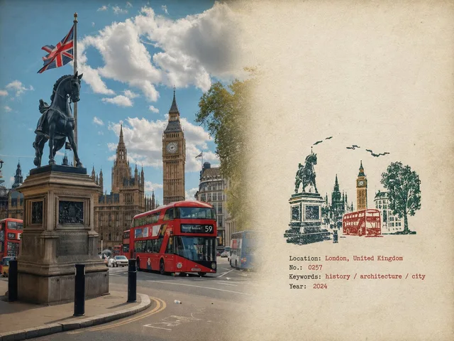
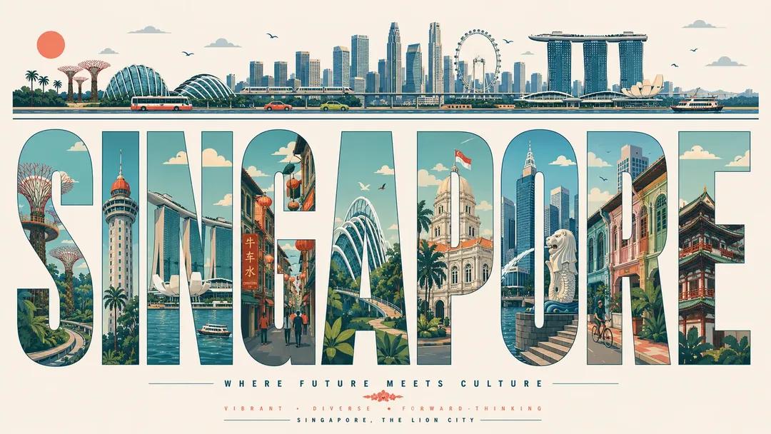
以 [CITY NAME] 为主题的超高分辨率排版旅行海报。 16:9 海报比例。 重要提示:海报上的每个可见单词都必须是英文、拼写完美、排版专业。没有扭曲的字母,没有随机的符号,没有损坏的文本,没有 AI 乱码。 CORE COMPOSITION : 将巨大的英文单词“[CITY_NAME]”放在前面和中间。每个字母都是高大、粗体、拉长的无衬线字体,每个字母都描绘出城市中不同的插图场景,就像一排画廊的窗户。将地标、街道、交通、自然、文化和建筑分布在字母上,使场景从一个字母流到下一个字母,形成一个相互连接的城市全景。 TOP HORIZONTAL STRIP : 海报顶部有一条薄薄的全景带:城市天际线轮廓、汽车、电车或火车、合适的船只、鸟类、云彩、太阳。保持简约、优雅、节奏平衡。 风格:中世纪现代社论海报、瑞士平面设计、最小矢量插图、建筑信息图感觉、旅行排版海报、平面几何插图、超干净的构图、优质杂志设计、丝网印刷海报氛围、复古未来主义旅行品牌。 ILLUSTRATION : 仅平面矢量形状。没有真实感,没有渐变,没有噪音。干净的几何阴影,简化的建筑形式,地图式自上而下与侧视图城市景观的混合。微妙的线条艺术细节、清晰的矢量边缘、强烈的负空间、字母之间和谐的节奏。 TYPOGRAPHY : 巨型粗体无衬线字母 填充大部分画布高度。像素完美对齐。每个字母都充当自己的带框插图面板。适合的地方采用柔和的圆角。编辑间距。可打印且几何形状干净。 COLOR PALETTE : 灵感来自 [CITY_NAME] 的有凝聚力的调色板: 沿海城市 -> 水绿色、沙色、珊瑚色、柔和的青色 沙漠城市 -> 赤土色、米色、暖奶油色 网络城市 -> 薄荷色、海军蓝、钢蓝色 历史悠久的欧洲城市 -> 尘土飞扬的玫瑰色、橄榄绿、羊皮纸 柔和的粉彩,柔和的复古旅行海报色彩,低饱和度。最大 4 至 6 颜色。 CONTENT : 包括标志性地标、著名的街道和交通、当地城市格局、附近的自然风光、天际线轮廓、桥梁/河流/海岸线(如果相关)、文化象征性建筑、可识别的当地氛围。 成分: 白色或柔软的象牙色背景上的居中排版。有很大的呼吸空间。顶部的全景带平衡了下面厚重的版式。不对称但视觉上平衡。每个字母都显示了自己的场景深度和视角。博物馆品质的海报层次结构。 MOOD:优质、知性、冷静、设计前卫、旅行编辑、足够时尚,适合博物馆礼品店的墙壁。 QUALITY:8K 超详细、可打印、锋利的矢量边缘、完美的排版、零扭曲文本、零随机字符、零拼写错误、零 AI 伪影。
 查看原图
原始提示词
Ultra-high-resolution typography travel poster themed around [CITY NAME]. 16:9 poster ratio. IMPORTANT: every visible word on the poster must be in English, perfectly spelled, professionally typeset. No distorted letters, no random symbols, no broken text, no AI gibberish. CORE COMPOSITION: Place the giant English word "[CITY_NAME]" front and center. Each letter is a tall, bold, elongated sans-serif form, and each one frames a different illustrated scene from the city, like a row of gallery windows. Spread landmarks, streets, transport, nature, culture, and architecture across the letters so the scenes flow from one letter into the next as a single connected urban panorama. TOP HORIZONTAL STRIP: Across the top of the poster, a thin panoramic band: city skyline silhouettes, cars, trams or trains, boats where it fits, birds, clouds, sun. Keep it minimalist, elegant, rhythmically balanced. STYLE: mid-century modern editorial poster, Swiss graphic design, minimal vector illustration, architectural infographic feel, travel typography poster, flat geometric illustration, ultra-clean composition, premium magazine design, screen-print poster vibe, retro-futuristic travel branding. ILLUSTRATION: Flat vector shapes only. No realism, no gradients, no noise. Clean geometric shadows, simplified architectural forms, a mix of map-like top-down with side-view cityscape. Subtle line-art details, crisp vector edges, strong negative space, harmonious rhythm between the letters. TYPOGRAPHY: Giant bold sans-serif, letters fill most of the canvas height. Pixel-perfect alignment. Each letter acts as its own framed illustration panel. Soft rounded corners where it suits. Editorial spacing. Print-ready and geometrically clean. COLOR PALETTE: Pull a cohesive palette inspired by [CITY_NAME]: coastal city -> aqua, sand, coral, muted teal desert city -> terracotta, beige, warm cream cyber city -> mint, navy, steel blue historic European city -> dusty rose, olive green, parchment Muted pastels, soft vintage travel-poster colors, low saturation. Max 4 to 6 colors. CONTENT: Include iconic landmarks, famous streets and transport, local urban patterns, nearby nature, skyline silhouettes, bridges/rivers/coastline if relevant, culturally symbolic architecture, recognizable local atmosphere. COMPOSITION: Centered typography on a white or soft ivory background. Lots of breathing room. The top panoramic strip balances the heavy typography below. Asymmetrical but visually balanced. Each letter shows its own scene depth and perspective. Museum-quality poster hierarchy. MOOD: premium, intellectual, calm, design-forward, travel-editorial, stylish enough for a museum gift-shop wall. QUALITY: 8K ultra-detailed, print-ready, razor-sharp vector edges, flawless typography, zero distorted text, zero random characters, zero spelling errors, zero AI artifacts.
以上为来源页所载提示词,可选中文本复制。本站译文与解读在下方单独列出。
中英对照
本条译文由自动翻译生成,可与原文对照使用。
Ultra-high-resolution typography travel poster themed around [CITY NAME]. 16:9 poster ratio. IMPORTANT: every visible word on the poster must be in English, perfectly spelled, professionally typeset. No distorted letters, no random symbols, no broken text, no AI gibberish. CORE COMPOSITION: Place the giant English word "[CITY_NAME]" front and center. Each letter is a tall, bold, elongated sans-serif form, and each one frames a different illustrated scene from the city, like a row of gallery windows. Spread landmarks, streets, transport, nature, culture, and architecture across the letters so the scenes flow from one letter into the next as a single connected urban panorama. TOP HORIZONTAL STRIP: Across the top of the poster, a thin panoramic band: city skyline silhouettes, cars, trams or trains, boats where it fits, birds, clouds, sun. Keep it minimalist, elegant, rhythmically balanced. STYLE: mid-century modern editorial poster, Swiss graphic design, minimal vector illustration, architectural infographic feel, travel typography poster, flat geometric illustration, ultra-clean composition, premium magazine design, screen-print poster vibe, retro-futuristic travel branding. ILLUSTRATION: Flat vector shapes only. No realism, no gradients, no noise. Clean geometric shadows, simplified architectural forms, a mix of map-like top-down with side-view cityscape. Subtle line-art details, crisp vector edges, strong negative space, harmonious rhythm between the letters. TYPOGRAPHY: Giant bold sans-serif, letters fill most of the canvas height. Pixel-perfect alignment. Each letter acts as its own framed illustration panel. Soft rounded corners where it suits. Editorial spacing. Print-ready and geometrically clean. COLOR PALETTE: Pull a cohesive palette inspired by [CITY_NAME]: coastal city -> aqua, sand, coral, muted teal desert city -> terracotta, beige, warm cream cyber city -> mint, navy, steel blue historic European city -> dusty rose, olive green, parchment Muted pastels, soft vintage travel-poster colors, low saturation. Max 4 to 6 colors. CONTENT: Include iconic landmarks, famous streets and transport, local urban patterns, nearby nature, skyline silhouettes, bridges/rivers/coastline if relevant, culturally symbolic architecture, recognizable local atmosphere. COMPOSITION: Centered typography on a white or soft ivory background. Lots of breathing room. The top panoramic strip balances the heavy typography below. Asymmetrical but visually balanced. Each letter shows its own scene depth and perspective. Museum-quality poster hierarchy. MOOD: premium, intellectual, calm, design-forward, travel-editorial, stylish enough for a museum gift-shop wall. QUALITY: 8K ultra-detailed, print-ready, razor-sharp vector edges, flawless typography, zero distorted text, zero random characters, zero spelling errors, zero AI artifacts.