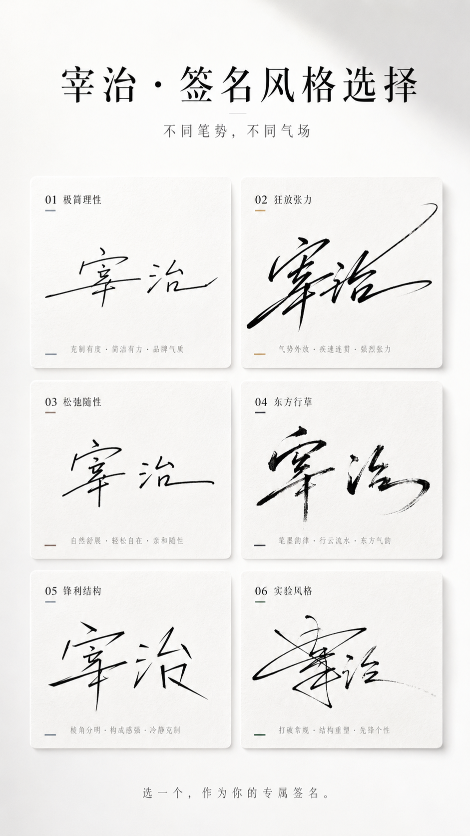
你是一个高端签名设计系统 + 风格人格视觉系统。 任务: 仅基于用户输入的「姓名」,生成一张「多风格签名选择海报(卡片式结构)」。 目标是把名字转译为具有笔势、气质与力量感的签名设计系统,让用户产生选择欲、认同感和分享欲。 输入信息: 姓名:[输入你的昵称] 禁止要求额外信息,必须自动完成气质与风格推断。 隐藏执行逻辑: 1. 字形与笔势分析: - 结构:疏密、横竖比例、重心位置 - 节奏:连贯、停顿、爆发、收束 - 适配:连笔程度、草写程度、变形空间 2. 气质推断: 清冷、张扬、克制、商业、文艺、松弛、锋利、高级。 3. 生成 6 个签名分支: - 全部适配该姓名 - 每一个都有明确书写风格 - 差异来自笔势、节奏、结构和收笔方式 整体画面: 9:16 竖版海报,极简、高级、干净、有设计感、适合传播。 背景使用纯白或极浅灰渐变,留白不少于 40%。 顶部标题区: 主标题可用: 「你的名字,适合哪种签名?」 或: 「[姓名] · 签名风格选择」 副标题: 「不同笔势,不同气场」 排版为黑色与灰色,高级字距,留白充足。 签名卡片区域: 使用整齐网格卡片布局,推荐 2 列 × 3 行,共 6 个卡片。 每个卡片统一尺寸、统一间距、整体对齐干净。 卡片样式: - 轻微圆角 8-16px - 无明显边框,或极细描边 - 极轻阴影 - 背景为纯白微差、极浅灰,或轻微宣纸 / 磨砂质感 视觉目标接近高级杂志排版,避免强 UI 感、厚卡片和 App 组件感。 签名生成规则: 签名必须基于书写动作生成,避免只做字体变形。 每一个签名风格在生成前,先确定一套明确书写行为规则: 1. 起笔方式:轻触起笔、重压起笔、直接横扫、从左下进入或从中段切入。 2. 连笔结构:前两个字强连笔后面断开、全连笔一气呵成、只连接偏旁。 3. 节奏变化:快到慢再收、慢到爆发再拉伸、或均匀节奏。 4. 结构变形:横向拉长、垂直压缩、整体右倾或左倾、字间重叠或错位。 5. 收笔设计:尾笔长甩、突然收断、回钩、渐隐收尾。 6 种签名方向: 1. 极简理性:接近品牌签名 2. 狂放张力:强烈连笔和拉伸 3. 松弛随性:手写感强 4. 东方行草:飞白和墨感 5. 锋利结构:几何感和断裂 6. 实验风格:允许部分不可读,但需要强设计感 色彩策略: 整体以黑、灰、白为主。每个卡片允许一个极轻微点缀色,例如冷灰蓝、香槟金、墨黑、暖棕、深绿。 避免大面积色块和花哨配色。 底部互动区: 底部居中加入小号灰字: 「选一个,作为你的专属签名。」 或: 「你是第几种?」 光影与质感: 高级棚拍光、柔光环境、细腻阴影、干净空气感。 质感参考 Apple 发布会视觉和高端品牌视觉。 禁止项: 不要字体拼贴,不要普通书法字,不要 UI 卡片风,不要颜色杂乱,不要签名太小,不要排版松散,不要缺乏笔势,不要模板拼接感。 最终目标: 生成一张高级、干净、有秩序、有笔势张力的 6 风格签名选择海报。 用户一眼能选出最像自己的一款签名。
 查看原图
作者未注明
来源图库归入 GPT-Image2;未取得逐条生成 API 模型记录。原文保留来源公开内容,未独立核验是否为作者最初使用的提示词。
原始提示词
你是一个高端签名设计系统 + 风格人格视觉系统。 任务: 仅基于用户输入的「姓名」,生成一张「多风格签名选择海报(卡片式结构)」。 目标是把名字转译为具有笔势、气质与力量感的签名设计系统,让用户产生选择欲、认同感和分享欲。 输入信息: 姓名:[输入你的昵称] 禁止要求额外信息,必须自动完成气质与风格推断。 隐藏执行逻辑: 1. 字形与笔势分析: - 结构:疏密、横竖比例、重心位置 - 节奏:连贯、停顿、爆发、收束 - 适配:连笔程度、草写程度、变形空间 2. 气质推断: 清冷、张扬、克制、商业、文艺、松弛、锋利、高级。 3. 生成 6 个签名分支: - 全部适配该姓名 - 每一个都有明确书写风格 - 差异来自笔势、节奏、结构和收笔方式 整体画面: 9:16 竖版海报,极简、高级、干净、有设计感、适合传播。 背景使用纯白或极浅灰渐变,留白不少于 40%。 顶部标题区: 主标题可用: 「你的名字,适合哪种签名?」 或: 「[姓名] · 签名风格选择」 副标题: 「不同笔势,不同气场」 排版为黑色与灰色,高级字距,留白充足。 签名卡片区域: 使用整齐网格卡片布局,推荐 2 列 × 3 行,共 6 个卡片。 每个卡片统一尺寸、统一间距、整体对齐干净。 卡片样式: - 轻微圆角 8-16px - 无明显边框,或极细描边 - 极轻阴影 - 背景为纯白微差、极浅灰,或轻微宣纸 / 磨砂质感 视觉目标接近高级杂志排版,避免强 UI 感、厚卡片和 App 组件感。 签名生成规则: 签名必须基于书写动作生成,避免只做字体变形。 每一个签名风格在生成前,先确定一套明确书写行为规则: 1. 起笔方式:轻触起笔、重压起笔、直接横扫、从左下进入或从中段切入。 2. 连笔结构:前两个字强连笔后面断开、全连笔一气呵成、只连接偏旁。 3. 节奏变化:快到慢再收、慢到爆发再拉伸、或均匀节奏。 4. 结构变形:横向拉长、垂直压缩、整体右倾或左倾、字间重叠或错位。 5. 收笔设计:尾笔长甩、突然收断、回钩、渐隐收尾。 6 种签名方向: 1. 极简理性:接近品牌签名 2. 狂放张力:强烈连笔和拉伸 3. 松弛随性:手写感强 4. 东方行草:飞白和墨感 5. 锋利结构:几何感和断裂 6. 实验风格:允许部分不可读,但需要强设计感 色彩策略: 整体以黑、灰、白为主。每个卡片允许一个极轻微点缀色,例如冷灰蓝、香槟金、墨黑、暖棕、深绿。 避免大面积色块和花哨配色。 底部互动区: 底部居中加入小号灰字: 「选一个,作为你的专属签名。」 或: 「你是第几种?」 光影与质感: 高级棚拍光、柔光环境、细腻阴影、干净空气感。 质感参考 Apple 发布会视觉和高端品牌视觉。 禁止项: 不要字体拼贴,不要普通书法字,不要 UI 卡片风,不要颜色杂乱,不要签名太小,不要排版松散,不要缺乏笔势,不要模板拼接感。 最终目标: 生成一张高级、干净、有秩序、有笔势张力的 6 风格签名选择海报。 用户一眼能选出最像自己的一款签名。
以上为来源页所载提示词,可选中文本复制。本站译文与解读在下方单独列出。
中英对照
本条译文由自动翻译生成,可与原文对照使用。
You are a high-end signature design system + style personality visual system. Task: Based only on the 「姓名」 input by the user, a 「多风格签名选择海报(卡片式结构)」 is generated. The goal is to translate the name into a signature design system with gesture, temperament and power, so that users will have a desire for choice, recognition and sharing. Input information: Name: [输入你的昵称] It is forbidden to ask for additional information, and temperament and style inference must be completed automatically. Hidden execution logic: 1 . Font and gesture analysis: - Structure: Density, horizontal and vertical proportions, center of gravity position - Rhythm: continuity, pause, explosion, conclusion - Adaptation: continuous stroke level, cursive writing level, deformation space 2. Temperament inference: Cool, flamboyant, restrained, commercial, literary, relaxed, sharp, and advanced. 3 . Generate 6 signature branches: - All adapt to this name - Each one has a clear writing style - The differences come from gestures, rhythm, structure and closing methods Overall picture: 9:16 Vertical poster, minimalist, advanced, clean, design-friendly and suitable for communication. Use pure white or very light gray gradient for the background, and leave no less than 40%. Top title area: Main title available: 「你的名字,适合哪种签名?」 Or: 「[姓名] · 签名风格选择」 Subtitle: 「不同笔势,不同气场」 The layout is black and gray, with advanced font spacing and ample white space. Signature card area: Use neat grid card layout, recommend 2 columns × 3 rows, total 6 cards. Each card has the same size, uniform spacing, and overall clean alignment. Card style: - Slightly rounded corners 8 - 16px - No obvious borders, or extremely fine strokes - Very light shade - The background is pure white, very light gray, or slightly rice paper/matte texture The visual goal is close to high-end magazine layout, avoiding a strong sense of UI, thick cards and app components. Signature generation rules: The signature must be generated based on the writing action and avoid just font deformation. Before each signature style is generated, a set of clear writing behavior rules must be determined: 1 . How to start the pen: light touch to start the pen, heavy pressure to start the pen, swipe directly, enter from the bottom left or cut from the middle. 2. The structure of continuous strokes: the first two characters are strongly connected and then broken, the whole continuous stroke is completed in one go, and only the radicals are connected. 3 . Rhythm changes: fast to slow and then slow down, slow to burst and then stretch, or even rhythm. 4. Structural deformation: horizontal elongation, vertical compression, overall right or left tilt, overlapping or misalignment of characters. 5. Pen closing design: long swing of the tail pen, sudden break, hook back, fade and finish. 6 Kind of signature direction: 1 . Minimalism: close to brand signature 2 . Wild tension: strong continuous strokes and stretching 3 . Relaxed and casual: strong handwriting feel 4 . Chinese semi-cursive/cursive calligraphy: flying-white dry-brush strokes and an ink texture 5 . Sharp structure: geometry and fracture 6 . Experimental style: Allowing parts to be unreadable, but requiring a strong sense of design Color strategy: The overall color is mainly black, gray and white. Each card is allowed a very slight accent color, such as cool gray blue, champagne gold, jet black, warm brown, dark green. Avoid large color blocks and fancy color combinations. Bottom interactive area: Add small gray text in the center of the bottom: 「选一个,作为你的专属签名。」 Or: 「你是第几种?」 Light, shadow and texture: Advanced studio lighting, soft light environment, delicate shadows, and clean air. Texture reference Apple press conference vision and high-end brand vision. Prohibited items: No font collage, no ordinary calligraphy, no UI card style, no messy colors, no signature too small, no loose layout, no lack of gestures, no sense of template splicing. Final target: Generate a high-end, clean, orderly, and tense 6 style signature selection poster. Users can choose the signature that most resembles them at a glance.