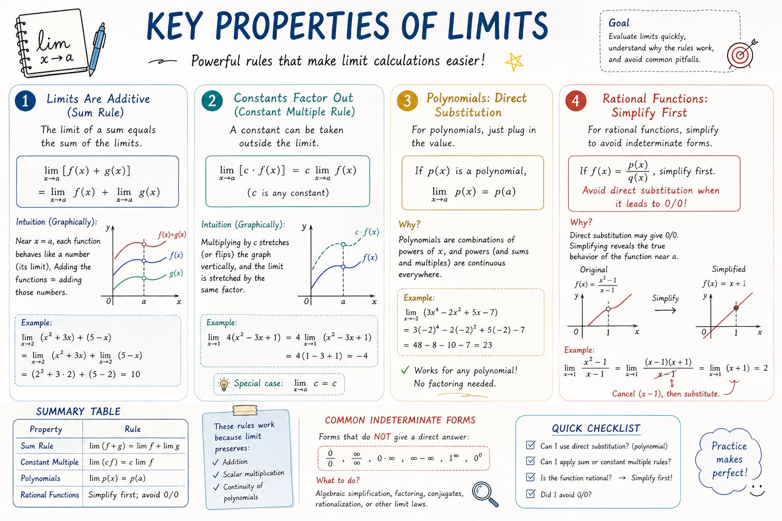
AP Calculus 学习表信息图查看原图
AP Calculus 学习表信息图图片作品 / 1280 × 853
作者与来源

@hqmank

来源图库归入 GPT-Image2;未取得逐条生成 API 模型记录。原文保留来源公开内容,未独立核验是否为作者最初使用的提示词。

01

原始提示词

英文 · 来源页原文

Please create a mathematical visualization infographic about "[math concept / topic]." The goal is to help the viewer intuitively understand what it is, why it works, its geometric or structural intuition, and how it behaves in different contexts. The visual should feel like a high-quality math lecture handout combined with a hand-drawn educational poster. It should be elegant, clear, and information-rich, but not cluttered. Visual style: either portrait or landscape is fine. Use a clean, light paper-like background, with a deep blue title and black or dark gray lines for the main content. Add a small number of refined accent colors such as blue, teal, gold, and red. Incorporate rounded-corner cards, thin borders, numbered labels, hand-drawn arrows, zoom-in callout boxes, and a summary section. The overall design should be aesthetically pleasing, balanced, and academic, allowing the viewer to grasp the structure of the concept and why it works at a glance.
以上为来源页所载提示词,可选中文本复制。本站译文与解读在下方单独列出。

02

中英对照

原文与本站译文

本条译文由自动翻译生成,可与原文对照使用。

中文ZH · 自动译文

请创建一个关于“[math concept / topic]”的数学可视化信息图。目标是帮助观看者直观地理解它是什么、它为什么起作用、它的几何或结构直觉以及它在不同环境中的行为方式。视觉效果应该像是高质量的数学讲座讲义与手绘的教育海报相结合。它应该优雅、清晰、信息丰富,但不混乱。视觉风格:纵向或横向均可。使用干净、浅色的纸状背景,使用深蓝色标题和黑色或深灰色线条作为主要内容。添加少量精致的强调色,例如蓝色、青色、金色和红色。合并圆角卡片、细边框、编号标签、手绘箭头、放大标注框和摘要部分。整体设计应该美观、平衡、学术,让观看者一眼就能掌握概念的结构及其原理。

EnglishEN · Original language

Please create a mathematical visualization infographic about "[math concept / topic]." The goal is to help the viewer intuitively understand what it is, why it works, its geometric or structural intuition, and how it behaves in different contexts. The visual should feel like a high-quality math lecture handout combined with a hand-drawn educational poster. It should be elegant, clear, and information-rich, but not cluttered. Visual style: either portrait or landscape is fine. Use a clean, light paper-like background, with a deep blue title and black or dark gray lines for the main content. Add a small number of refined accent colors such as blue, teal, gold, and red. Incorporate rounded-corner cards, thin borders, numbered labels, hand-drawn arrows, zoom-in callout boxes, and a summary section. The overall design should be aesthetically pleasing, balanced, and academic, allowing the viewer to grasp the structure of the concept and why it works at a glance.