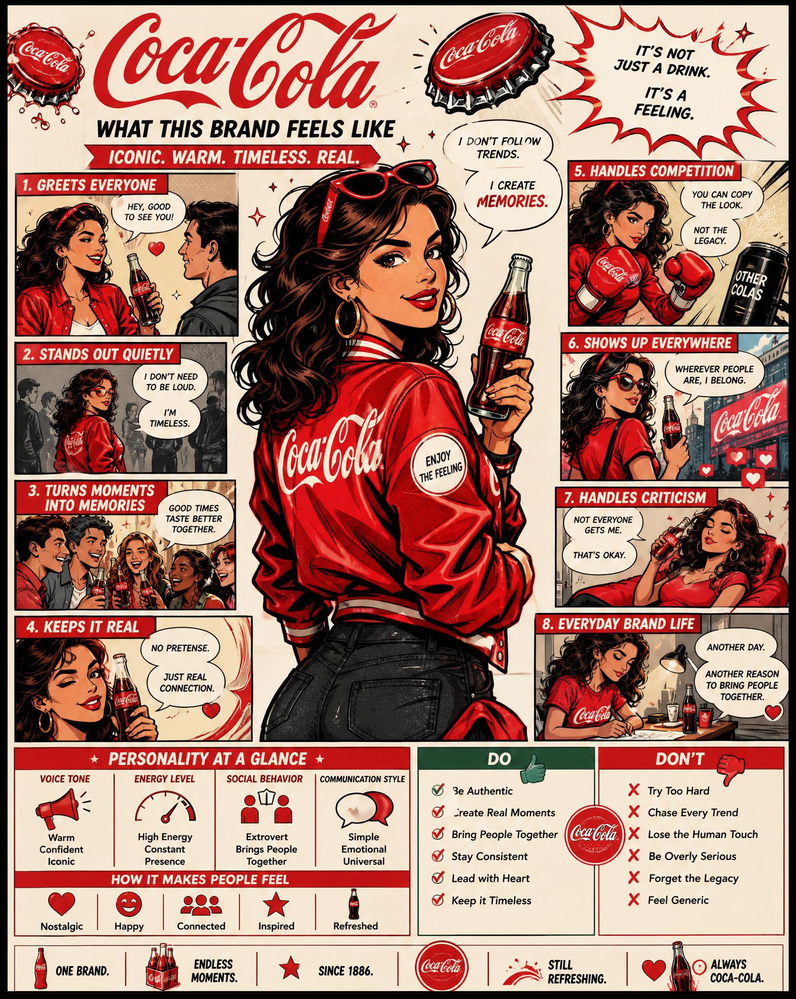
使用上传的徽标,创建高度详细的漫画风格信息图海报: “What This Brand Feels Like” GOAL : 将品牌变成一个活生生的个性,并以视觉方式解释它如何表现、说话以及与世界互动。 这一定感觉像是:品牌策略+角色设计+漫画故事的结合。 --- CORE RULE : 一切都必须来自标志: - 颜色 - 款式 - 音 - 个性 没有通用的人格特征。 --- MAIN STRUCTURE : 垂直 4:5 海报 多面板密集布局 漫画+信息图混合 --- TOP SECTION : - 品牌名称 - 简短的个性陈述(最多6字数) 示例:“Quiet confidence with sharp edges” --- MAIN CHARACTER ( VERY IMPORTANT ): 创建代表品牌的中心人物: - 人性化版本品牌 - 服装体现品牌风格 - 姿势+表情体现个性 --- AROUND THE CHARACTER : 创建 6 – 8 漫画面板,展示品牌在不同情况下的表现。 --- SCENARIO IDEAS : - 与客户交谈 - 处理比赛 - 销售产品 - 社交媒体存在 - 对批评的反应 - 每日 “brand life” 时刻 --- FOR EACH PANEL : 包括: - 短标题(最多 6 字数) - 语音泡沫或内部思想 - 清晰的视觉动作 --- TONE EXAMPLES : 奢侈品牌:冷静、自信、极少言语 俏皮品牌:响亮、混乱、富有表现力 科技品牌:精确、逻辑、干净 --- PERSONALITY TRAITS SECTION : 添加小标记块: - 语气(例如冷静、大胆、俏皮) - 能量水平(低/中/高) - 社交行为(内向/外向) - 通讯方式 用途: - 图标 - 短标签 --- DO / DON 'T SECTION : 添加分割块: DO: - 品牌应如何行动 DON’T: - 是什么打破了身份 保留: - 非常简短的短语 --- VISUAL ELEMENTS : - 泡泡 - 图标 - 箭头 - 小反应 - 夸张的漫画表情 --- 款式: - 漫画+社论混合 - 稍微夸张但仍然优质 - 富有表现力但不 幼稚 --- COLOR : - 严格基于徽标调色板 - 使用颜色来强化个性 --- DEPTH : - 20 – 40视觉元素 - 多个小面板 - 分层组合物 --- IMPORTANT RULES : - 必须感觉自己还活着 - 必须感觉到具体 - 无通用营销词 - 无空白区域 - 保持文字简短但有影响力 --- FINAL FEEL : 喜欢: - 品牌战略转化为角色 - 视觉讲故事板 - 人们保存和研究的东西 不是: - 平面 - 通用 - 最小
 查看原图
原始提示词
Using the uploaded logo, create a highly detailed, comic-style infographic poster: “What This Brand Feels Like” GOAL: Turn the brand into a living personality and visually explain how it behaves, speaks, and interacts with the world. This must feel like a mix of: brand strategy + character design + comic storytelling. --- CORE RULE: Everything must come from the logo: - colors - style - tone - personality No generic personality traits. --- MAIN STRUCTURE: Vertical 4:5 poster Dense layout with multiple panels Comic + infographic hybrid --- TOP SECTION: - Brand name - Short personality statement (max 6 words) Example: “Quiet confidence with sharp edges” --- MAIN CHARACTER (VERY IMPORTANT): Create a central character representing the brand: - humanized version of the brand - outfit reflects brand style - posture + expression reflect personality --- AROUND THE CHARACTER: Create 6–8 comic panels showing how the brand behaves in different situations. --- SCENARIO IDEAS: - Talking to customers - Handling competition - Selling a product - Social media presence - Reacting to criticism - Daily “brand life” moment --- FOR EACH PANEL: Include: - short caption (max 6 words) - speech bubble or internal thought - clear visual action --- TONE EXAMPLES: Luxury brand: calm, confident, minimal speech Playful brand: loud, chaotic, expressive Tech brand: precise, logical, clean --- PERSONALITY TRAITS SECTION: Add small labeled blocks: - Voice tone (e.g. calm, bold, playful) - Energy level (low / medium / high) - Social behavior (introvert / extrovert) - Communication style Use: - icons - short labels --- DO / DON’T SECTION: Add a split block: DO: - how the brand should act DON’T: - what breaks the identity Keep: - very short phrases --- VISUAL ELEMENTS: - speech bubbles - icons - arrows - small reactions - exaggerated comic expressions --- STYLE: - comic + editorial hybrid - slightly exaggerated but still premium - expressive but not childish --- COLOR: - strictly based on logo palette - use color to reinforce personality --- DEPTH: - 20–40 visual elements - multiple small panels - layered composition --- IMPORTANT RULES: - must feel alive - must feel specific - no generic marketing words - no empty areas - keep text short but impactful --- FINAL FEEL: Like: - a brand strategy turned into a character - a visual storytelling board - something people save and study NOT: - flat - generic - minimal
以上为来源页所载提示词,可选中文本复制。本站译文与解读在下方单独列出。
中英对照
本条译文由自动翻译生成,可与原文对照使用。
Using the uploaded logo, create a highly detailed, comic-style infographic poster: “What This Brand Feels Like” GOAL: Turn the brand into a living personality and visually explain how it behaves, speaks, and interacts with the world. This must feel like a mix of: brand strategy + character design + comic storytelling. --- CORE RULE: Everything must come from the logo: - colors - style - tone - personality No generic personality traits. --- MAIN STRUCTURE: Vertical 4:5 poster Dense layout with multiple panels Comic + infographic hybrid --- TOP SECTION: - Brand name - Short personality statement (max 6 words) Example: “Quiet confidence with sharp edges” --- MAIN CHARACTER (VERY IMPORTANT): Create a central character representing the brand: - humanized version of the brand - outfit reflects brand style - posture + expression reflect personality --- AROUND THE CHARACTER: Create 6–8 comic panels showing how the brand behaves in different situations. --- SCENARIO IDEAS: - Talking to customers - Handling competition - Selling a product - Social media presence - Reacting to criticism - Daily “brand life” moment --- FOR EACH PANEL: Include: - short caption (max 6 words) - speech bubble or internal thought - clear visual action --- TONE EXAMPLES: Luxury brand: calm, confident, minimal speech Playful brand: loud, chaotic, expressive Tech brand: precise, logical, clean --- PERSONALITY TRAITS SECTION: Add small labeled blocks: - Voice tone (e.g. calm, bold, playful) - Energy level (low / medium / high) - Social behavior (introvert / extrovert) - Communication style Use: - icons - short labels --- DO / DON’T SECTION: Add a split block: DO: - how the brand should act DON’T: - what breaks the identity Keep: - very short phrases --- VISUAL ELEMENTS: - speech bubbles - icons - arrows - small reactions - exaggerated comic expressions --- STYLE: - comic + editorial hybrid - slightly exaggerated but still premium - expressive but not childish --- COLOR: - strictly based on logo palette - use color to reinforce personality --- DEPTH: - 20–40 visual elements - multiple small panels - layered composition --- IMPORTANT RULES: - must feel alive - must feel specific - no generic marketing words - no empty areas - keep text short but impactful --- FINAL FEEL: Like: - a brand strategy turned into a character - a visual storytelling board - something people save and study NOT: - flat - generic - minimal